minimalist-shadows https://phseiff.com/e/why-i-like-my-website why-i-like-my-website
me.jpeg
me.jpeg

phseiff.com

Hello! I'm Phii, and I'm an avid non-commercial developer, manga-binge-reader, vegetarian, programmer, writer and denglish-speaker. This is my blog, and I'll be uploading my thoughts on various random topics and links to my programming projects here over the next months/years. You can also visit me on github if you'd like to!
Criticism of everything I'm saying, as well as issues with any of my programming projects are always welcome, as long as you don't mind me fixing them ;)

Oh, and by the way: I see you have javascript deactivated for this site. Luckily, the site also works without javascript, but it will be more responsive if you activate it, plus I don't collect any data without your explicit permission. ;)

my projects


Some of my project, on whom I work in my freetime.
I pour a lot of heart blood into most of these, so feedback is always appreciated, and I love collecting shiny sparkly little stars on GitHub, so if you want to make me happy and they somehow helped you, go and show them some love :3

some essays


Here are some of my essays, at least those that are somewhat finished yet.
I use a system of ✨sparkles✨ to categorize how much effort went into each of those, or how much confidence I have in them, so you're not disappointed if you didn't like an essay I didn't pour my whole heart into. :3

Enjoy! :D

Why rejecting shadows is NOT required for good minimalistic design

I happen to browse the internet quite a lot, even more so when I am procrastinating. And since most of my knowledge comes from me procrastinating and thus googling useless stuff, most of my knowledge consists of .html files, tidily well-ordered in shelves within my brain. Said html happens to usually contain some css to make it look younger than 2002, and said css usually uses minimalistic design. Which I actually love because it hurts my eyes less than your average windows 7 window manager.

What I don't love, however, is people thinking their minimalistic design gets any better by not applying shadow to anything, making everything flat and looking like a piece of cheap inlaying artwork (looking at you, microsoft website). There is a reason why lots of design principles like Material Design place value on the layering of elements using shadow; the reason being not applying shadow is not required to achieve minimalistic design.

When we think about minimalist design, what pops up in our minds are often minimalist frontpages of photographers web presences with only two words, a link and a small sprinkle of color to accentuate. However, minimalist web design can also encapsulate complex blogs, tools, forums, news sites and services that naturally have a lot of information to serve. We tend to forget (partly because of what is usually shown as examples of minimalist design and what isn't) that minimalist design does not mean showing little, but showing less, only the necessities, rid of all distractions. Minimalistic does not necessarily imply that there is vey little going on, but that what is going on is reduced to the minimal amount of overload possible whilst still serving its information.

The question if shadows can -and thus should- be omitted in minimalist design is easily answered with a yes when talking about really small and naturally information-light things such as frontpages, but it is far more complex when talking about naturally information-heavy things like blogs with a handful of necessary gui-elements for easy navigation, and I feel like people tend to ignore these cases and wrongly assume that shadows can -and thus, should- always be omitted even in these complex cases.

And they are wrong.

To prove my point, I'll take the central principle of minimalist design, the central idea that binds all derivatives of minimalist design, be it in physical art or be it in web design, together, and derive possible legitimations for said idea from a deductional standpoint as if I'd never even heard of minimalist design. Follow me open-minded and try to ignore your budding scepticism until I get to explain the reasons for this approach later on.

One of the most refreshing aspects of minimalist design is, from a linguistic standpoint, that the word itself is minimalistic. It's not an euphemism, it's not a summary, but it is in itself a throughout description of what divides minimalist design from other design principles:

Minimalist design is simply design that is minimalistic, and since minimalism is pretty well-defined, we can formulate the principle of minimalist design as

important things > important things + unimportant things

As you might have noticed, something being unimportant does not necessarily imply something being bad on its own. After all, having something unimportant is always better than having nothing. Whilst this might still be somewhat opinionated and can surely be debated, we can still assume that content provided in a web format, if its necessity is actively debated, is not actively worse than nothing - if it was actively BAD on its own, said badness should usually be recognized and the element removed before even questioning its compliance with minimalistic design.

Which is why we can assume that

unimportant thing > 0

The question this raises is how an unimportant things better than nothing can be worse than if it wasn't there at all once it is in conjunction with important things.

The only valid reasons are that either (a) unimportant things get better if one has nothing else, (b) they get worse if one has important things with them, and (c) important things get worse if they are in conjunction with less important things. You will have noticed that (b) and (c) are distict in that (b) is about the unimportant thing being denigrated by the important one and (c) about being the other way round.

Let's look at all of these and show why only one of them makes sense:

  • (a) unimportant things get better if one has nothing else : True, but not applying to shadows due to the supportive nature of shadows - a shadow is always cast by something, supporting it, and pretty much worthless on its own or even incapable of existing in and on itself.

  • (b) unimportant things get worse if one has importat things with them : Nah, I don't think so. The good things might distract us from the unimportant things, but not focusing on something does not make it necessarily bad. Or, to be more specifically, shadows don get worse if one doesn't look at them, since they are not intended to be intensively focused on in the first place. Removing something unimportant out of fear an important thing might distract from it is generally useless on its own since it is in the very nature of unimportant things that being distracted from them does no harm.

  • (c) important things get worse if they are in conjunction with less important things : If the important thing is to communicate something, this holds true. The reason why the unimportant thing might take away from the important thing is, analogous to point (b), that it distract from it. After all, whatever one intends to communicate should be focused on by the reader, and said focus being taken away by something thus takes away from the important thing intended to be focused.

Conclusively, we can agree on precisely one valid reasoning for the equation at the core of minimalist design, and use said reasoning -minimalist design attempting to remove distractions- to make a list of different "distraction types", on which we may be able to allocate the interaction between shadow and narrative to see if, and in which way, shadows might be distractive, and if the way in which they are distractive violates the reasoning behind minimalist design:

(i)   important things distracting from unimportant things
(ii)  important things distracting from important things
(iii) unimportant things distracting from unimportant things
(iv)  unimportant things distracting from important things

But first, we will rule out which one of these distraction types it is we have to fear:

  • (i) important things distracting from unimportant things : Well... yeah, that's kinda what we want, isn't it? I mean, we want the reader to focus on what's important, and if we get them to unfocus on the useless stuff around them at the same time, that's twice the win. So nothing wrong with that.

  • (ii) important things distracting from important things : Imagine having two important things. Let's call them foo and bar, as all important things are called. We know that one of them will distract from the other one. Now we have two options: Leave one of them out, or bot leave one of them out. If we leave one of them out, the user will only concentrate on one of them since only one of them is left. If we don't leave one of them out, the user will concentrate on one of them, ad leave the other one out. Nothing changes. However, the option to leave something out is simply not an option if we are talking about important things. It's out of scope. I mean, look at this text. Its uppe rhalf is distracting from its lower half (which it really is, I mean, thee is actually no need to see everything one has already read on the upper half of the screen whilst reading the lower half), so if we leave it out, the reader will be less distracted from this essays lower half. I'm not being sarcastic here, I realy mean it: Deleting huge portions of this essay would seriously help remove distraction from the rest of it. Would it be a good idea, though? No, because both halves of the essay are important, and leaving one important thing away to not distract from the other important thing seriously impacts the message you want your pair of important things to communicate, together, united.

  • (iii) unimportant things distracting from unimportant things : This ain't gonna hurt no one, since being distracted from something unimportant is inherently not a bad thing. After all, it is unimportant. If one distracts the reader from something unimportant, one just replaces one unimportant thing with another. I mean, they both shouldn't have been there in the first place, but who cares if they suddenly decide to switch places in the viewers mind?

  • (iv) unimportant things distracting from important things : This is a real thread. You want to communicate something, and something else distracts from it. That's not what you want.

Accordingly, we can assume that the only reason shadows might contradict the reasoning behind minimalist design is reason (iv).

Now, you might raise the question why we went through all these loosely-shadow-related deductions about the nature of minimalist design up there, and that's a pretty valid question since we could've gotten to this point a lot faster by just stating that minimalist design is legitimated by the urge and need to remove distractions, which it is, according to most designers and design specifications. We would've, however, missed two important points by doing so:

  1. Jumping straight to the reason why minimalist design is generally useful does not allow us to show that other logically derivable reasons are bad reasons, which would not allow us to redeem shadows based on one specific legitimation of minimalist design, but instead require us to show their compliance with a multitude of possible legitimations of minimalist design. We basically just ensured no smartass can come along and be like "Well, you showed that shadows don't defy the idea of minimalist design based on its most common legitimation, but here I am proclaiming that minimalist design can also be legitimated by [insert a, b, i, ii or iii]".

    This was what we generated (a), (b) and (c) for.

  2. We ended up creating a list of possible nemeses of minimalist design, and showed that all of them except for one aren't generally dreadful, which allows us to easily argue whether applying shadow to UI elements is inherently dreadful to good minimalist design or not by checking if it falls under the "dreadful distraction-type" iv or not.

    This was what we generated (i), (ii), (iii) and (iv) for.

Our reasoning and its necessity might be best illustrated by a tree with two different levels, one for (1) and one for (2):

Tree of minimalist reasoning and nemeses

After showing the dread shadows might pose as well as our reasoning, we can finally rule out which, if any, distraction type shadows fall into, and thus, if they are truly dreadful.

To do so, we can assume we have two things:

things1 = shadows
things2 = something (partially) styled by using shadows

Of these two assumptions, the existence of thing1 is pretty much the premise of the entire discussion and can thus be assumed, and the existence of thing2 follows since a shadow never comes alone; it's always drawn by something. We can assume that nothing else except thing1 and thing2 exists, since the "(partially)"-part in the definition of thing2 allows thing2 to cover the entirety of things that are not shadows.

We don't actually need to know which case -case (i), (ii), (iii) or (iv)- we can assign this scenario to; all we need to know is if said case is case (iv) or not. For case (iv) to hold true, one of the following must apply:

  1. thing1 is important, thing2 is unimportant, and thing2 distracts from thing1

    This would require thing1 -the shadows- to be of higher importance than thing2 -the rest.

    However, since shadows themselves are pretty much useless on their own -as said before, even the very capability of shadows to exist on their own can be debated-, and since shadows usually have a supportive character in communication since they add to something instead of being something other things add information too, we can safely assume that thing1 is of equal or lower importance than thing2. If the shadow was more important than what draws it, the rightful question could be raised how an accent can be more important than the letter it thrones on, an underline more important than the word it underlines, a spotlight more important than what it is shed on, to which there is no satisfying answer.

  2. thing1 is unimportant, thing2 is important, and thing1 distracts from thing2:

    This case is easily contradicted by showing that thing1 -the shadows- are not unimportant.

Case (1) is already contradicted, and to additionally contradict case (2), all that must be shown is that shadows are not unimportant.

And yes, they are not. Because shadows do not distract from communication, they do communication. Applying a shadow to something usually shows that it is supposed to be closer to the reader that whatever lays behind it, like something being stickied to a surface. And something being stickied to a surface, like a sticker, usually conveys a message about the surface, something which should be taken in relation of this surface. For example, a sticker with a price contains a message about the thing the sticker is stickied to (how much it costs), and a banner containing an icon usually means that whatever it is stickied to falls under the category symbolized by said icon. By making a banner showing an icon or some text flat, the user does not see if they are looking at the icon through a window or if it is in front of the surface surrounding it. Essentially, the user gets less information on what relates to what and what is more important than what. Shadow adds a third dimension to a text, a gui, to literally anything you want to display on a flat thing like a paper or a screen, and more dimension means more room to use placement to communicate your ideas. So shadow is not an unimportant thing. It is part of what you are doing, not just decoration, because it helps you communicate what you want to communicate, and that is what design is all about. Removing shadow because it might distract from the rest is like removing half of this essay because it distracts from the other half.

In case you have lost track of this somewhat curvy line of thought, here is the route back to where we came from:

  • We have now shown that shadows are not unimportant.

  • Thus, applying shadows does not trigger case iv.

  • Thus, they are not a nemesis of minimalist design.

  • And what can be a nemesis of minimalist design was ruled out beforehand based on a good legitimation for the existence of minimalist design, and the question what defies that legitimation.

  • And that this legitimation is the only really good one there is was shown at the beginning by using the underlying idea of minimalist design: minimalism in general.

♜ Tower defense

Building a castle is worth nothing if one does not defend it afterwards, and the same goes for essays. There are always things that don't fit in, as well as counter arguments who are inherently covered by ones arguing, yet might still come up. Sometimes, the coverage of counter arguments slips the attention of the reader, and sometimes, a counterpoint is better addressed in a defensive style than in an offensive style. Sometimes, you write an essay, and you can already see a very specific counter argument coming when you write it. And sometimes, instead of incorporating said argument into ones line of thought and arguments, it's easier and keeps the text from being cluttered and distracted to just prove it wrong after the line of thought is finally delivered.

If I covered a specific cornercase, yet I know people are going to miss that and come back to it, I technically covered that argument, yet it might still be worth talking about the argument at the end of the essay nonetheless. And likewise, if I know that a specific, pretty likely counterargument to my essay is logically flawed, it technically poses no "harm" to my argumentation, yet it might still be worth talking about the argument at the end of the essay to show how it is flawed.

That's why I will divide all of my essays into two parts: One main part with constructive reasoning for what I try to show, and one purely defensive part where I respond to some potential counterarguments to either show that they are logically flawed or that the point they make was already covered by my reasoning in the first part and is, in fact, not an argumentation hole. The second part might also grow after I released an essay as new arguments pile up.

So let's get started with this essays tower defensefind:

  • Minimalist design gets along without overlapping elements if it is well-done, so shadows are not needed to add a third dimension.

    In fact, websites are usually scrollable, especially if they contain huge amounts of text. And sometimes, huge amounts of text are necessary, simply because text tends to be made out of text and people tend to read this stuff. Dynamically loading text instead of having a scrollbar is often not an option either, because sometimes, you don't want to rely on javascript, and to be honest, scrolling text is pretty damn useful.

    The problem is that, even in scrollable websites, there might still be a need for some elements to be permanently visible. This includes cookie banners that legally need to inform the visitors of cookies until they click "okay" or "x" as well as up- or down-buttons needed to get back to the top of the page really fast, or gui elements if what you are scrolling through can be edited like a document in a text editor.

    If you have elements that stay where they are whilst all other elements can be scrolled, it's crucial to communicate that these elements are always in front of other elements so the user gets exactly the behavior they expect, and this can -for example- be done by using shadows for elements with fixed positions. So "elements will never overlap each other if minimalist design is done properly" is pretty simplifying.

  • Emphasizing things (e.g. with shadows) when there are only necessary things on the screen is not required.

    This is false when talking about buttons, since only necessary elements being on a screen does not mean that they don't deserve different amounts of focus. Every element moved from a screen means that it takes more time to reach one more element with your mouse, so moving EVERYTHING except for one thing off the page is usually not an option. For example, if there is an "Okay"-button, there's usually also a "Cancel"-button around, and whilst one of these might deserve more emphasisis to communicate that it is supposed to be the default option, removing the other one from the page would seriously break things. Efficiency in button pressing sometimes forces us to put more things on a page, and more things force us to add emphasises on some things.

  • Adding shadows to convey hierarchies is skeuomorphic and thus contradicting minimalist design.

    A sceuomorphism is a design element imitating a real-life thing to communicate the way it works to the user, such as the grips on the scrollbars in Windows 7 or the way early OSes imitated plastic buttons with their buttons. And yes, sceuomorphisms are usually too opulent to be minimalistic, and tend to loose their relevance as time progresses and people get increasingly accustomed to the abstract concepts behind computer screens, as can be seen by the increasing foremarch of abstract (sometimes minimalist) design philosophies. However, what stems from history (sceuomorphic) and the ideal solution to a problem (minimalism) can sometimes overlap or even be the same. Let's take paper as an example: Paper is usually white and written on with black lettering. Texts on desktop screens are also white and covered in black letters, words and sentences. We can assume that this is for historical reasons, a sceuomorphism if I ever have seen one, yet this coloring also happens to be the ideal one even though computer screens allow other ones. Yes, one might argue that dark mode was better than light mode, but we could still assume that white mode is better and make this a thought experiment, and the reasoning would still work. This shows that something originating as a sceuomorphism does not necessarily make it non-minimalist.

  • The amount of things being conveyable by shadows is limited to adding a third dimension and emphasizing things.

    This is broadly simplifying. Generally, a shadow can have any radius/intensity from 0 (no shadow at all) to whatever number. Thus, a shadow can communicate any scalar property a thing might have, such as its importance or z-position, but also its nestling depth (useful for comments) or even more special cases such as its evilness or the time remaining until it automatically disappears. Limiting shadows to two thinkable usages when they can communicate really any number property is boldly uncreative.

  • Your definition of "important" and "unimportant" are arbitrary.

    No, they are not, because I have no specific definition of the concept of importance. All I am assuming is that importance is a scalar property measured subjectively by the one who judges it (the artist or web designer attempting to communicate something and placing different value on different things), and that said person draws a line between "important" and "unimportant" based on the importance of a thing at an arbitrary, yet somewhat constant, point, which is something generally possible for any scalar property.

After responding to some possible counter arguments (or maybe strawmen?) to the point I am making, I'd like to drop some words about my motivation for writing this essay and making it the first one on my website.

In general, I don't care too much about minimalist design and its use of shadows. It's not a topic I hold especially dear, or one that I can rant about for hours. Yet that's the reason why I made it my first essay: To try out the format, introduce concepts such as the Tower Defense, and show my way of thinking: to focusing on dividing questions into abstract logical problems, dividing these into different logical cases, and reassemble these afterwards, instead of weighting pros and cons against each other. I also made this essay to test out my website's coding and see if it will be correctly displayed -after all, I coded everything myself- and to get some opinions from acquaintances before I dedicate myself to more important topics.

Final words

Shadows are not automatically evil, they are not some kind of confetti sprinkled around a webpage, but actively communicate things. If used correctly, they are not some kind of decoration, not some marker to put emphasis on a button, but something that actively communicates. As they say, a shadow can say more than a thousand words. I hope that I was able to fight some prejudices against shadows in UI design, and you might have gotten somewhat closer to forgiving me for all the shadows on my website thorough this essay.

(C) 2020, 2021 phseiff - For the license, see here.
This html file was autogenerated with <3 using my github-flavored markdown-to-html-generator. Give it a try!

Why I am proud of my website

even though it gets no visitors and I don't have the time to make a lot of content for it.

The preview image of the repository I have my website's code in

As you would know if I (illegally, for obvious reasons) published tracking data for my website, I haven't really had any visitors since I created it. After all, why would I? There is barely any content on my Website, even if you count the two project cards I added recently, and every other bit of content somewhat meta-heavily resolves around the very essence of my Website.

Then why would I be proud of it?

Because I made a lot of good design decisions, lots of clever engineering, a handfull of innovative solutions, one full-fledged markdown conversion tool, loads of sophisticated optimizations and my own website builder in the process, just to create a website with barely any content yet. In a way, my biggest overkill ever.

And yet I am proud of it! Because I learned a lot in the process, and I created a lot in the process, and I can flex a lot with my Website whenever I find someone willing to listen to me. Which actually is exactly what I will be doing in this essay: Talk about the many design decisions that went into my Website, and how sophisticated it does the hosting of some none-existent essays. Expect this essay to be a little technical, since I am a programmer type of Person, and those tend to refer to code design decisions when they talk about design decisions.

With that being said and the introduction out if our way, let's dive right in into the juicy details! I will go over them using a nestled bullet point list, but that's because these things are easier to navigate than classic paragraphs, so be prepared to read full paragraphs of text within them!

Into the rabbit hole of self-congratulation

It worth noting for all of these topics that my website is a static website, so there is no server side magic available for any of this.

  • Performant one-page website:

    My whole website is served within one single HTML file (including some external resources like CSS, images and javascript, of course). Every link within my website is internal and either calls some javascript (if javascript is enabled), or scrolls to an anchor (if it isn't); more about this later.

    Why does it look like there are several pages within the website, then?

    In general, my website is divided into one main page, which shows an introduction sentence and a list of all of my projects and my essays, and a multitude of "subpages", which are opened by clicking essay cards on my website, among other things. Each one of my essays, for example, has its own "subpage". When you click on an essay card (and potentially some other things, depending on how this website develops), you immediately, with no loading time save for a quick animation in which the page seems to scroll "up" towards the newly opened subpage, end up on the corresponding subpage. The content of the essay is shown, and a red cross in the upper-right corner appears which you can click to make the essay disappear again, returning you to the main page with another scroll animation.

    Opening a subpage not only displays additional content in the window, but also changes several other things associated with switching to another page. The URL in the URL bar changes to something like phseiff.com/e/name-of-the-essay, the title of the tab changes, and metadata relevant to search engines like the description of the page, the preview image of the page and even its language changes; and vice versa when you leave a subpage. Entering a subpage link like phseiff.com/e/name-of-the-essay into your browser, vice versa, leads to an empty dummy page that redirects to phseiff.com/#name-of-the-essay, which is then unfolded into phseiff.com/e/name-of-the-essay (the real one, not the dummy) by a bunch of javascript in phseiff.com that interprets the requested anchor and translates it to a subpage.

    You might have guessed that this is done using javascript, which is executed every time an essay card is clicked; however, there are some things worth noting here:

    • The content of the essays is hidden until it is unhidden by javascript, but it is not loaded by the javascript.

      This is relevant because it means that my website is indeed a single-page-website, and loaded all at once. This means that you can open my website, disable your internet, and still access all of its contents, without having to manually cache every single page of it. It also implies better performance, since having the small overhead of loading some extra kilobyte of essay text (and a bunch of images, whom I might change to javascript-loaden if this becomes too much of a burden later) is much preferable over making separate server requests for every single subpage, each of whom varies only in parts of its content rather than relevant heavy boilerplate code. Having everything within the page at loading time is also relevant for supporting people who disabled javascript, but we will talk some more about that later.

    • Advanced as well as simple crawlers and applications find all subpages, including their metadata.

      Advanced crawlers like the ones used by Google for page indexing emulate pages in a headless browser. This allows them to identify javascript-generated subpages, so every subpage (phseiff.com/e/foo, phseiff.com/e/bar, et cetera) is correctly recognized as its own page, including its title, description, language and contents, as indicated by the javascript-modified meta tags. Google Search Console confirms this works, so ideally, every page should be its own entry in the search engine. In practice, Google only indexes the main page, since it determines the subpages to be "content-identical" to the main page (which is an issue I will have to look into some time), but at least it seems to recognize them as separate entities, according to the Search Console ;)

      There are also many applications for which a lookup of the page is performed by simply loading the HTML from the page and parsing it, rather than loading the page with a headless browser, which means that these applications will receive the dummy page at phseiff.com/e/foo rather than the contents of the actual subpage. For applications like these, be it crawlers of primitive search engines or a social media platform looking up the OpenGraph protocol metadata of the page, each dummy page contain the metadata of its respective subpage, too.

    • The page is fully operational even if javascript is disabled.

      It might come as a surprise that all of this works if one has javascript disabled as well. This is implemented by serving the page as a page that works without any javascript at all, and then executing some javascript that modifies it into a page that works based on javascript. This modification to a javascript-based website, since it is based on javascript itself, is only executed if javascript is enabled.

      When served, every subpage's content is visible all at once (but below all other elements of the page rather than between the introduction and the essay cards, to ensure the essay cards remain at the top as a table of contents), and each one has its own id so it can be linked to using page-internal anchor links. Analogously, every essay card uses a page-internal link to link its subpage; for example, one essay card might link to #foo, where #foo is the ID of the subpage that is usually accessible via phseiff.com/e/foo. There are also two arrows, one scrolling to the top and one scrolling to the footer of the page if one clicks them, permanently displayed when javascript is disabled. All of this is obviously not the best user experience, but it allows easy navigation and accessing all the contents of the page even without js. The redirection dummy pages also work with javascript disabled, so even entering the domain of a subpage directly into the browser works as expected with javascript disabled.

      If javascript is enabled, on the other hand, all of these elements are changed directly when the page loads; subpages are hidden, #subpage-links are changed to something along the lines of javascript:set_location("subpage");, #top-links (and similar ones) are changed to something along the lines of javascript:smooth_scroll("top");, the to-the-top and to-the-bottom buttons are hidden unless one is far away from their intended destination, and so on.

      The non-javascript version of the page is also not exactly optimized for SEO, but that's okay because the biggest relevant search engines all use headless browsers with activated javascript to analyse web pages.

  • Writing my own website-builder:

    I also wrote my own website builder from scratch in Python. It's a pretty simple one, but I had to do it in order to support my website's architecture.

    My website builder does essentially do two things:

    1. Maintain the RSS feed and the essay- and project cards on my website.

      Both of these things are handled by manually editing an RSS file called feed-original.rss, which is used for building the essay cards, and a subset of which is used for the actual RSS feed of my website, based on meta-tags that indicate whether an item is intended to be part of the final RSS feed or just a card on my website.

    2. Maintain the subpages of my website (which is done by manually managing a folder full of markdown files, where foo.md describes the contents of the phseiff.com/e/foo subpage, with no additional action required to be done to add them to my website other than creating them).

    There are, of course, some details here, in which I'd like to further dive:

    • Splitting the input of the website builder and the actual website code into separate repositories:

      I really want people to see my website's code and potentially profit from it, as well as get attention for it wherever possible (hehe), so my website's code and parts of its website builder are in a public GitHub repository. The markdown files that describe my essays, as well as the html-files immediately generated from them, as well as my RSS feed, are of course also accessible by anyone, because (a) they are embedded into my website, and (b) they are completely hosted, including every bit of code; however, I don't have them in a public repo, because I don't want people looking over my shoulder whilst I work on them, dig through their git history, make pull requests or view my repo out of context, plus I can't be bothered to add the context to which website it belongs to the repository in which I have my website's content.

      For this reason, I have my website's content in a private repository, transparent since its contents are hosted via GitHub pages, and simultaneously shielded from the uninterested public. Pushing changes to this repo, as well as seeing (or not seeing) the clock hit 00:00, causes the repo to run an action which builds its RSS feed, converts all markdown files to HTML, and then triggers an action in my public website repo which embeds the subpage's HTML files into the website and builds the essay- and project cards. The public repository also re-builds the website when I push any changes, of course.

    • Maintaining the website's cards and RSS feed:

      As mentioned above, I maintain a file called feed-original.rss within my website contents repository. This RSS feed contains information describing the different types of cards on my website, both those that link to subpages ("essay cards") as well as those that link to external pages ("project cards"). The feed, littered with non-standard meta-tags that describe additional contents of the cards, is then parsed into the cards, and a subset (with some items and non-standard tags removed) of the feed is parsed into an actual RSS feed that can be accessed from my website. New subpages also result in a post in my personal mastodon instance.

      The following table offers some additional details, if you are interested in the exact way I orchestrate my website.

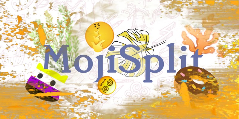
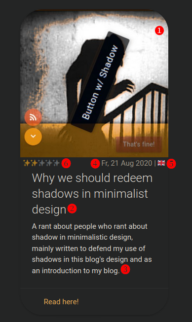
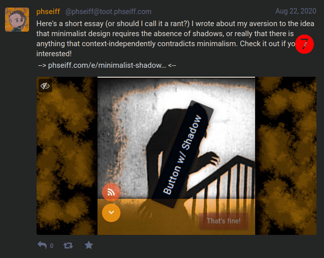
      If I add, for example, an entry like the following to feed-original.rss (

      <item>
        <image> https://phseiff.com/phseiff-essays/shadows.jpeg</image>
        <title> Why we should redeem shadows in minimalist design</title>
        <description> A rant about people who rant about shadow in minimalistic design, mainly written to defend my use of
      shadows in this blog's design and as an introduction to my blog.</description>
        <link>https://phseiff.com/#minimalist-shadows</link>
        <pubDate> Fr, 21 Aug 2020 18:00:00 +0200</pubDate>
        <language> en</language>
        <phseiff:effort> 2/5</phseiff:effort>
        <phseiff:announcement>     Here's a short essay (or should I call it a rant?) I wrote about my aversion to the idea that minimalist design
          requires the absence of shadows, or really that there is anything that context-independently contradicts minimalism.
          Check it out if you're interested!
        </phseiff:announcement>
       </item>
      

      ), then I get an essay card as shown on this image into my website.

      In this format (skip this if the details don't exactly interest you):

      • is the image (I just save shadows.png, and it is automatically compressed and resized to shadows.jpeg.
      • is the title of the essay card
      • is the description on the essay card
      • is the creation date of the content
      • is the language of the content (displayed as a flag)
      • describes how much effort/ confidence I put into/ have in the content, to generate my fancy sparkle rating
      • is a text for announcements and for my RSS feed.

      An image of a corresponding essay card, with a fitting description, title and image

      Adding something to the RSS feed also creates a post in my personal Mastodon instance, as can be seen on this image:
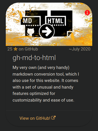
      An image of a toot on mastodon with the corresponding content

      I can also add a project="true" attribute to any item, in which case the resulting card is added to the project list in my website rather than the essay list, receives a (regularly updated) star count if it links to a GitHub repository rather than language information and a sparkle count, and gets its image build from the repository's preview image, with a fancy orange overlay.

      The code for this looks, examplary, pretty much like this (

      <item project="true">
         <image> https://phseiff.com/phseiff-essays/gh-images/github-flavored-markdown-to-html.jpeg</image>
         <title> gh-md-to-html</title>
         <description> My very own (and very handy) markdown conversion tool, which I also use for this website. It comes with a set of unusual and handy features optimized for customizability and ease of use.</description>
         <link>https://github.com/phseiff/github-flavored-markdown-to-html</link>
         <pubDate> ~July 2020</pubDate>
       </item>
      

      ), where:

      • the image is build from the repository preview image of the repository the card links to; the rule being that the contents of https://phseiff.com/phseiff-essays/gh-images/foo.jpeg are a compressed JPEG of github.com/phseiff/foo's preview image with an added orange overlay to fit int my website's color scheme.
      • pretty much everything else is like in every other essay card.
      An image of a project card on my website
    • Converting markdown-files to html:

      I also wrote a custom markdown-to-html conversion tool for my website, because I wanted to have GitHub README styled subpages whilst still having formula support, which later grow from a tool to inject umlauts into multiline code blocks in GitHub's online markdown API (which GitHub doesn't natively support due to an unfortunate chain of technical limitations) to a tool into which pretty much every markdown converter can be plugged, and which results in GitHub-styled html- and pdf files with some added tweaks and sparkles. This quickly became my so-far biggest tool (🥲), and you can visit it on GitHub if you wanna leave some stardust or, like, actually use it.

      Anyways, what I want to talk about here is how it integrates with my building pipeline.

      Essentially, every markdown file in my content-repository is thrown into the converter and a html file is generated for each one. All of these have host-ready relative links to all images they reference (a feature of gh-md-to-html), and all of them share a single css file. In addition, every image any markdown file references is automatically downloaded, stored in a separate folder, converted to progressive JPEG if it isn't one already, receives a mono-colored background, and some compression with some losses. The image is then stored in 10 different resolutions, and all of them are put into the image's srcset attribute, ensuring that the browser loads the minimal resolution that is needed for the given screen size.

      This allows me to just reference whatever image I use, as a PNG with 3000x2000px, or even images that some ominous source hosts on the web with integrated visitor tracking, without needing to worry about saving the file, compressing it, making different resolutions from that, or having a slow and unsave webpage as an alternative. Another thing worth noting is that since the images are loaded using the srcset attribute, the src attribute remains free for any use case, so I use it to store the full-size image URL in - this causes Google Images to show the images from my website in their full resolution (including transparency) rather than in their compressed and pixelated form.

      I think this is a pretty neat feature to have in a markdown converter (I'm not aware of any others with srcset support), and it makes sure that all these images stay within reasonable bandwidth boundaries.

      The html pages are then added to a list, which my website builder in my public repo then reads to then proceed to embed every single file into my one-page website as a subpage.

  • Auto-generating darkmode with a headless browser:

    When I first started working on my website, I intended it to have a dark- as well as a light mode, which adapted to the user's system preference, since I was really big on darkmode back then. I implemented this using DarkReader, which is mainly a browser extension for injecting darkmode into websites using javascript, but also comes with a js-module for use in websites. DarkReader, with the settings I used it with, detects someone's system-wide darkmode-settings and adapts to it by either applying darkmode or not applying darkmode.

    However, I quickly noticed that darkreader didn't properly detect darkmode on Chromium on Linux, which sucked because some of my friends used Chromium on Linux, and that I actually don't like how my website looked in lightmode. Plus, the slightly dusty orange that darkreader generated was a nice contrast to the muddy grey it spilled across my website's background, so why not embrace that and make it my brand identity?

    I thus changed my website to always use darkmode, no matter the system settings. This left my site with lots of javascript that generated a darkmode on runtime once the site was loaded, resulting in a white flash at the beginning of the loading time and a lot of js execution overhead (around two second, if I recall it correctly).

    I ended up building an extra step into my website building pipeline, which emulates the website using a headless browser, and then extracts the css generated by DarkReader from the website with a functionality I specifically asked the maintainer of DarkReader for. The resulting css is then stored in a css file, and all calls to DarkReader that the website contains are replaced with simple links to the generated stylesheet.

    This does, admittedly, slow down the pipeline quite a lot (not really problematic, since GitHub action minutes are pretty much free), and it means I can't precisely pick a color because it'll always be shifted by DarkReader, which is problematic if I want a color in my texts to fit a color in an image; but on the other hand, it makes designing color schemes much easier since I can just pick the brightest color available, and it'll always be shifted into a tasteful shady muddy look that goes quite well with all the other colors. For elements I really want to keep their color, I can also just use the HTML style-attribute, since DarkReader can't create CSS to change them (after all, how should it address the element if there is no query to describe the element?).

    But let's be honest, the whole thing is a pretty hacky solution, and it's one that adds a lot of technical debt to the whole website and accumulates a lot of hassle when it comes to fine-tuning colors in an essay. Had I anticipated that there wouldn't be a lighmode on the site before I wrote it, I might habe done things differently; but then again, I might not even have this cool harmonic colorscheme I have right now if I had tried to do a darkmode color scheme from scratch.

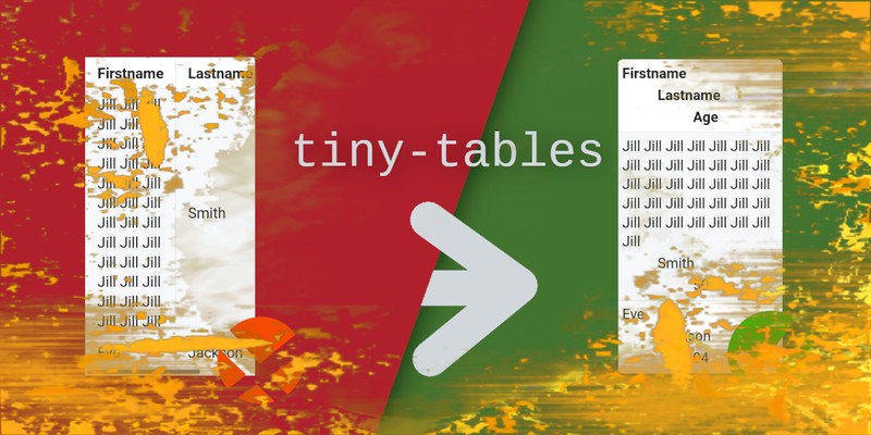
  • Mobile-friendly tables aka the fanciest tables in the west:

    It's a pretty minor thing with quite a minor impact, but it's a pretty special thing and I have never seen another website do this, so here I go including it within my blog post.

    When you see a table on a website (e.g. Wikipedia) on desktop, it usually looks somewhat like the following:

    A long table with some exemplary data which isn't really relevant

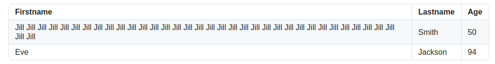
    If you are on mobile, however, and your screen is small, the table often doesn't fit into the viewport, and ends up overflowing with a nasty horizontal scrollbar, hurting usability and SEO alike.

    My website circumvents this problem by adding a special layout for tables that would otherwise overflow, depending on the table's content and the current viewport width, so rather than a crammed table like this (

    A table with a horizontal scrollbar since it is too wide to fit into its viewport

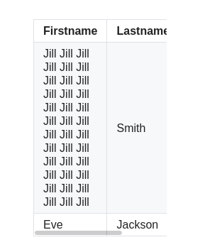
    ), the visitors get a table like the following on my website:

    A table with no horizontal scrollbar, because the individual fields of every row are displayed stacked underneath each other (with increasing indention) rather than horizontally next to each other

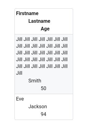
    In case you mind me nerding about the way I implemented this for a while, you can skip to the next section, or look at the relevant file in this website's GitHub repository directly.

    Essentially, I wrote two solutions, one with javascript and CSS, and one in pure CSS. As is the case with pretty much everything on my website, the CSS solution is somewhat limited, whilst the javascript solution deactivates the CSS solution (only if javascript is enabled, of course) and replaces it with its own way of doing things.

    I will look at both solutions separately in the following:

    • The pure CSS solution:

      This uses some pretty simple CSS that re-styles all tables within a query that ensures it's only applied if screen-size<600px. This comes with the two disadvantages that (1) some tables might be large enough to overflow even if screen-size>599px, and (2) all column indents are hard-coded, which means that every field past the 7th field (or so) of a row is not indented at all, and that tables with more than 4 columns (or so) will overflow even with the extra style applied.

      Both of these issues are fixed by the javascript-implementation.

    • The javascript+CSS solution:

      This comes in two steps:

      1. As soon as the entire DOM is loaded (even before css and images finished loading), a custom CSS class is created for every table (not yet assigned to it, though). This CSS class describes how the table should look like on a screen on which it'd otherwise overflow, and it contains enough indention levels for all columns, and the indention widths are adjusted to the amount of columns the table has, to make sure no field is indented more than 90px.

        This solves issue (2) of the CSS-only solution.

      2. Every time the viewport is resized (and one time each after the DOM and the assets of the website are loaded), a function is called (by binding to DOMContentLoaded, loaded and resize events) that iterates over all tables of the document and assigns each one its minify-class (in case it overflows), and un-assigns it again (if doing so is possible without causing an overflow). The pure CSS solution is kept as an intermediate solution through all of this until all images are loaded (triggering the load event), to ensure that tables with images in them don't require horizontal scrolling until all images are loaded.

        This solves issue (1) of the CSS-only solution, and it does so pretty efficiently since it adds no overhead other than a function call on resize and two on page load (the call on DOMContentLoaded, in case you wondered, isn't really necessary, but it reduces the time until layout shift is finished for subpages without text-only tables).

    I feel like this way of handling tables should be way more popular than it apparently is (please tell me if you know of any website that does somewhat similar, I'd love to see it!), and I hope you might've found it useful - feel free to use its code, which is mostly MIT licensed.

  • Other optimizations & Gadgets I spent way more time on than I probably should have:

    • 404 Error page:

      I have a neat-looking error page that you might not have seen so far, if you don't happen to manually freestyle-type the address of my so-far only essay into your browser bar on a daily basis (which I wouldn't recommend since it is not the greatest essay).

      You can find it at https://phseiff.com/fofobarbar (or any other non-existent URL on my domain, of course).

    • SEO optimization:

      I also spent a long time (much, much longer than I probably should have) on optimizing my website for SEO using the Chromium Light House tool, a variety of website speed tests, and some other SEO analysis tools that I won't mention since they decided to become subscription-only tools completely unanticipated. I managed to get into each one's respective "green area" mainly by adding things like title, description, language, OpenGraph-protocol meta tags and TwitterCard meta tags to each one, and by optimizing the page's loading speed by adding automated compression to all images and moving darkmode creation from the website to the website builder.

      The results where quite well, although the underlying optimization where extremely premature considering my website's audience (noone who stumbles across it through the web) and its amount of content so far.

    • image compression of images outside the subpages:

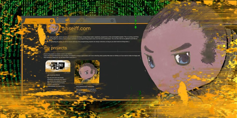
      All images within my essays are compressed automatically to reduce loading time, as described above. Raster images that aren't part of any essay, but still part of my website, are referenced as JPEG images by the source code, but maintained as full-scale PNG images, and converted to JPEG automatically by my website builder, in case you wondered about the size of this profile image on the top left of my website.

    • fancy image zooming:

      Many people like to see images in their full resolution, especially if they intend to save them, which is a problem since all images are by default compressed. Also, many images in my essays are displayed in an image size too small to make out all of their details. Therefore, it is possible to click on any image (you might have noticed the zoom cursor icon when hovering over them), which loads the original uncompressed PNG-image in its full size (potentially not displayed in full size, though, if the display is too small) into the view port, from where it can be copied like any other image (the image is loaded on-demand as to not take any unrequired bandwidth, obviously.

      I can also add a -icon. to the image's file name if I want it to be un-zoomeable, and a -noborder. if I want it to be displayed without the pretty border that surrounds each image.

    • ethical tracking:

      Since I don't host my webpage myself, but rather, host it on GitHub pages, I can't do server-side visitor counting or anything to see the numbers of my visitors evolve over time. And even if I could, it wouldn't help me much, since I would not be able to see how many people visited which subpage due to the one-page nature of my website.

      My solution to this was using a self-hosted tracking service (in my case, Matomo, due to its open source and ethical nature), and make it opt-in on my website - there's a cookie banner that you can remove by opting in, and a detailed explanation of why I use cookies and what I use them for that you can read and reach from the cookie banner.

      I originally thought that making the cookie banner stick until one opted in to the tracking was pretty reasonable, since the data is collected anonymously and in reasonable amounts, and nudging people into the direction of being helpful -as an individual, not as a company, mind you- by giving them a better experience if they opt in by removing the cookie banner seemed somewhat logical to me. After all, if I was running an Ice cream parlor, I could also count my visitors without asking for consent, and refusing to let me know one visited me even though I only need it for my own statistics and for improving the things I am working on in itself stroke me as rude enough to plant an unremoveable cookie banner into the visitor's face.

      But after some reconsidering and getting exclusively negative feedback from my friends, I realised that people who don't really know me other than from seeing my website have no real reason to trust me, and that even if they could trust me and still decided to not be helpful, paying unhelpfulnes back by being unhelpful oneself is not the best approach as someone who offers something and want people to be convinced of and like that thing.

      For this reason, I decided to add a "Nope"-option to my cookie banner, which you can either see in action on my website already or will see in action as soon as I find time to implement it.

      That being said, hosting a frickly website analysis tool on one's own infrastructure at home is probably not the most efficient thing to do, especially since it results in large downtimes whenever I carry infrastructure around with me, and matomo is not really optimized for one-page websites, so the way I do it is probably not quite ideal.

      But hey, I ask for consent, and I have an option to revoke it, so other from being a nuisance for my visitors, there isn't really anything to criticize here.

  • The backside & domain price bragging:

    The whole thing is, of course, not always as smooth as I depict it here. Almost every time I write an essay for this website, something turns out not to work like I intended it to work, and every time, I end up tweaking something just to fit that little essay. There are also lots of dirty other things, like generally chaos when it comes to ordering everything into different files, and using whacky push pipelines that automate git add, git commit and git push alongside other things that should be done by GitHub actions, probably (in my defense, at least it's all properly documented, named and throughoutly commented). It's also not the prettiest thing imaginable that I end up putting things like intro texts straight into my website's main template, but hey, that's how it is.

    On a more positive note, my domain name is quite easy to remember, grippy and handy, and costs me only $18 per year :)

Wrapping it up

I guess in a way, you could say this essay is me making peace with the fact that I didn't create as much content for my website as I would've liked to in the past 8 months, but it is also, at least partially, me realizing how much I've grown over the past year, both personally and professionally, and how much this website illustrates that and how much there's yet to come.

Anyways, I hope you had fun reading this, and that there were at least a handful of solutions you found interesting, be it positive or negative. :)

(C) 2020, 2021 phseiff - For the license, see here.
This html file was autogenerated with <3 using my github-flavored markdown-to-html-generator. Give it a try!

(c) 2020 phseiff - All rights reserved

You are hereby granted to do the following in regards to the content offered to you under this license (referred to as "the content" in the following), unless otherwise noted:

  • Copy the content

  • Redistribute the content

  • Spread the content

  • Cite the content as something that was created by me, phseiff

Under the condition that you

  • Include this license and copyright note as well as the information that it was created by me, phseiff

You may, however, not do any of the following:

  • Say or imply the content was created by you

  • Print the content or otherwise transfer it into a non-digital format including, but not limited, to stone engravings, printed paper or symbols written in cornfields, without my priorly given explicit written permission

  • Say or imply that I support your use, redistribution or interpretation of the content

  • Mis-cite me or otherwise untruthfully say or imply I voiced a view or opinion through the content (in the following referred to as "I said" or "I deemed") even though I didn't; including, but not limited to any of the following:

    • Saying I said b even though I said that a implies b without saying I believe a to be true
    • Saying I deemed something unnecessary even though I just said I deemed something else more important
    • Saying I deemed something to be foo even though I just said it might be foo
    • Saying I said foo, but not explaining how I defined foo, even though I introduced my own definition of foo before saying foo and in a way which is clearly intended and well-positioned to be read before reading that I said foo, if my explicitly introduced definition of foo varies from the general public's or your audiences definition of foo.
    • Saying I equaled A and B even though I just equaled property x of A and B, since A.x == B.x is quite distinct from A == B.

I reserve myself the right to change this license into a more liberal version of itself in the future, with more permissions and less restrictions.

In case any of the above restrictions, allowances and conditions turns out to not comply with a law applicable to it, the other restrictions, conditions and allowances are withdrawn (until I publish a new license mentioning the incident) if it is legal for me to do so (as well as legally binding for you) and remain unaffected if it is not.


End of the license - everything beyond this line is not part of the license and thus not legally binding.


  • If you want to print the content, feel free to ask me - I believe myself to be a very open person about this kind of requests, but I won't allow indefinite amounts of my work printed, even though I will probably allow any reasonable number (which might be very height, given that I usually deal with 64-bit-integers when programming. Well, maybe not that height.)

  • The reason why I don't allow the last point of the last restriction (and why it actually is a form of mis-citation) is that even if I said foo, saying I did so without giving the context that I introduced an alternate definition of foo beforehand unavoidably communicates that I hold a believe or opinion that I actually don't and never communicated in that way, communicating that I communicated an opinion which I never communicated. Since correct citation is all about correctly citing the content and not the literal letters someone published, and the content is altered even though the lettering is correctly reproduced in the given scenario, I would consider it mis-citation.

  • I am aware that standing up against mis-citation in a license and that forbidding it is complicated since essays are usually read before the license, thus making this part of the license questionable. However, I consider mis-citation a form of slender (which is a complicated political topic on which I might comment in an essay sooner or later), which is why I intend to place a signal of disagreement with any such form of mis-citation through this license.

  • I am not a lawyer. Feel free to contact me as well as raise an issue in one of my github repositories (after all, I am a friend of transparency) if you feel parts of this license are legally problematic, and I will try to look into it.

  • If you feel some parts of this license are morally problematic or make the use or redistribution of content under this license highly unattractive for you, feel free to hit me up on it and I'll look into it.